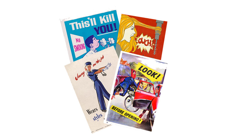
Safety posters are a great communication tool that have appeared in workplaces for over a hundred years. It is believed that safety posters started being used in the workplace during the Industrial Revolution in the mid-1800s. Posters were often text-heavy and focused on behavior in the workplace. However, these posters were not effective since the workers had low literacy rates and were unable to read the message on the posters.
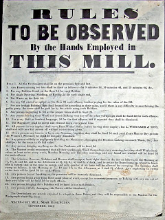
Graphic design was introduced to make the posters more attractive. The posters evolved from messages that blamed the workers for accidents to a more proactive approach for prevention. Even though most people can read today, it has been proven that when presented with a poster with a lot of reading versus one that only has a few words and images that demonstrate the point, people tend to remember the latter.
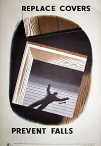
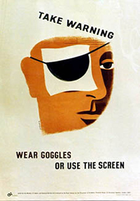
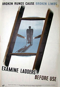
Blaming workers and inciting fear has also proved to be ineffective. The Royal Society for the Prevention of Accidents (RoSPA) produced a series of accident prevention posters in World War II. The idea behind these posters was to reach an audience of workers in factories who had not been previously employed. These posters are simple in their design and follow the “less is more” rule of effective posters. You’ll note the designs are blunt—minimal text that delivers a direct message and equally clear images that demonstrate the outcome if you don’t heed the safety warning. The block colors are not distracting and the white space draws the eye to the text and image in order for it to be digested quickly. These are great at delivering a safety message, especially given that the audience may not have training or a long history of navigating workplace safety issues.
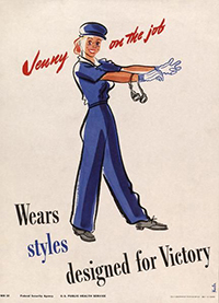
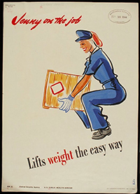
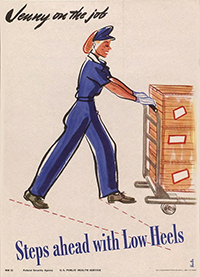
World War II also found an influx of women in the workplace since the men went off to war. The “Jenny on the job” posters were published by the Public Health Service in 1943, with the goal of being more relatable to female workers. They align with the minimal text rule and depict images of a woman performing the task and conveying the message each poster is meant to deliver.
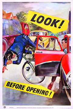
In the decades after WWII ended, the goal of safety posters shifted from the workplace to off-the-job safety. RoSPA produced this great off-the-job safety poster showing how the increasing congestion of cars in the 1960s led to complacency surrounding bicycle use.
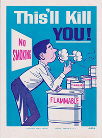
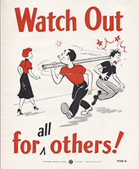
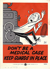
The National Safety Council published a series of safety posters ca. 1950 – 1970. It’s almost humorous to a contemporary audience how obvious these posters are, but these mid-century safety messages were needed to spread the word about workplace concerns that were relatively new at the time.
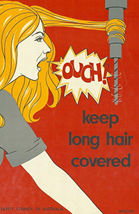

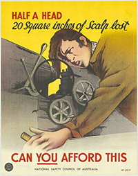
The National Safety Council of Australia also published a series of safety posters ca. 1970 – 1980. The messages are still as clear as the previous posters, with limited text and easily understood visuals. Containing a little more color, these posters were sure to get more attention than the posters from the WWII era.
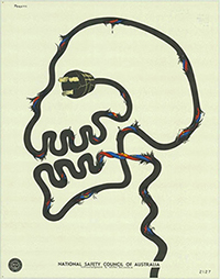
The final image on this National Safety Council Australia poster is so effective that no words are required. The shape of the skull is enough to draw people in to want to learn more, and the frayed wire is the obvious cause of this worker’s demise.
If you want to learn more about poster design by today’s standards, check out our poster guide.

